Churn is the metric that makes or breaks a subscription business. But most teams either don't track it precisely enough, or they track it in a way that's hard to act on. This guide shows you how to build a churn analysis in Google Sheets that gives you both the number and the insight behind it.
Calculating Monthly Churn Rate
Churn rate is customers lost divided by customers at the start of the period. You need three numbers for each month: customers at start, customers at end, and new customers acquired.
Customers lost = Customers at start + New customers acquired - Customers at end.
Churn rate = Customers lost / Customers at start.
Build a monthly table with these columns: Month, Start Count, New, End Count, Lost, Churn Rate. Calculate Lost:
=B2+C2-D2
Calculate Churn Rate:
=E2/B2
Format as percentage. Track this every month and plot it as a line chart. Churn rate should trend down over time as you improve the product and support.
Revenue Churn vs. Logo Churn
Logo churn (percentage of customers lost) and revenue churn (percentage of MRR lost) tell different stories. A business that loses 10 small customers but retains its 2 largest enterprise accounts has high logo churn but low revenue churn.
Calculate revenue churn the same way but substitute MRR values for customer counts. Compare the two rates monthly — if revenue churn is consistently lower than logo churn, it means your larger customers are stickier, which is usually a good sign.
Cohort Retention Analysis
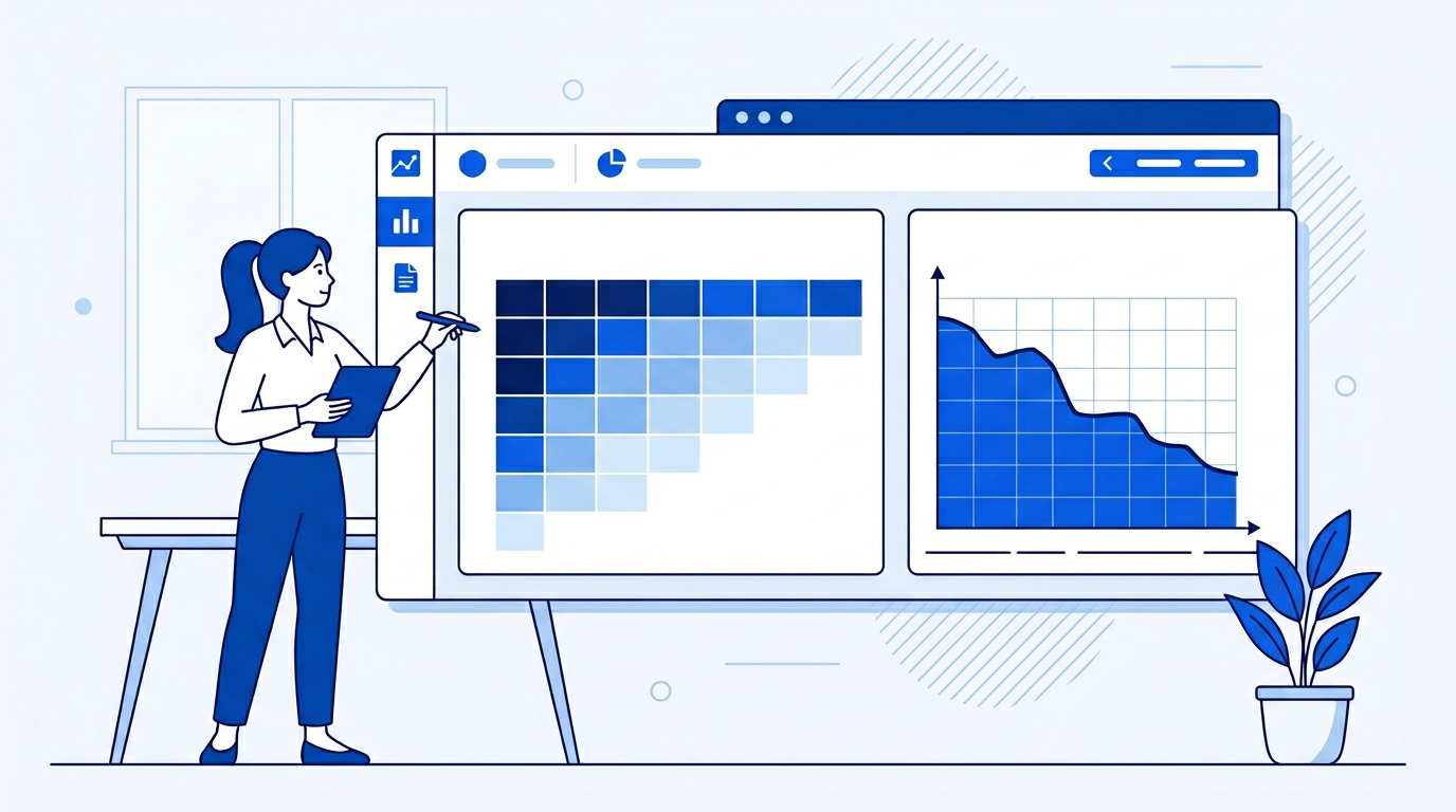
A cohort analysis shows how well you retain customers who joined in a specific month. Build a grid with acquisition month in rows and months since acquisition in columns. Each cell shows the percentage of that cohort still active.
Use COUNTIFS to populate each cell:
=COUNTIFS(CustomerList!B:B, A2, CustomerList!C:C, ">="&DATE(YEAR(A2),MONTH(A2)+B1,1))
Where B is the acquisition month, C is the churn date (blank if still active), A2 is the cohort month, and B1 is months since acquisition. Divide by the cohort size to get retention percentage.
Apply a heat map color scale to the cohort grid — darker green for higher retention, red for low. This makes it immediately visible which cohorts retained well and which didn't.
Identifying At-Risk Customers
Add a churn risk score to your active customer list based on leading indicators: last login date, support tickets opened, product usage, and NPS score. A customer who hasn't logged in for 30 days, has 3 open tickets, and gave an NPS of 4 is at high risk.
Use a weighted scoring formula across these signals and sort by risk score descending. This gives your customer success team a prioritized call list.
The Easy Way: Using SheetXAI in Google Sheets
Example 1: You have customer data already in the spreadsheet.
"I have a customer list with acquisition dates and churn dates. Build a monthly churn analysis showing logo churn rate and revenue churn rate, a cohort retention table for the last 12 months, and a heat map showing retention by cohort."
SheetXAI reads your data, calculates churn rates, builds the cohort table, and applies the heat map formatting.
Example 2: Your customer data lives in your CRM or billing system.
"Pull customer subscription data from Stripe and build a churn analysis showing monthly churn rate, revenue churn, and cohort retention for the last 12 months."
SheetXAI connects to Stripe, pulls the data, and builds the full churn dashboard.
Try SheetXAI free and see what it builds for you.
Published May 2026. See also: How to Calculate MRR in a Spreadsheet, How to Build a KPI Dashboard in Google Sheets, and Google Sheets AI Guide.

